Since 2007, the growth of total federal debt has nearly doubled the growth of annual GDP...and if/when the next recession or war/pandemic/natural disaster occurs...the explosion of debt vs GDP will be off the charts. But this isn't an article about that...this is an article about housing, about the "housing shortage". The reason I include federal debt is that I'll suggest rather than a shortage of houses, there was/is a surplus of $'s that created a buying frenzy absent the like growth in potential occupants...and suggest that is likely to be an issue in the near to midterm.

Regarding illegal or undocumented immigration, there are widely varying estimates of 3 to 9 million immigrants entering the US since 2020 but more importantly are the employment #'s. If there are millions of low/no income immigrants entering with little savings...and that isn't resulting in millions of new full-time employees (amid a housing affordability crisis that already has home prices out of reach for native born, young working age adults) ...Houston, we have a problem?!?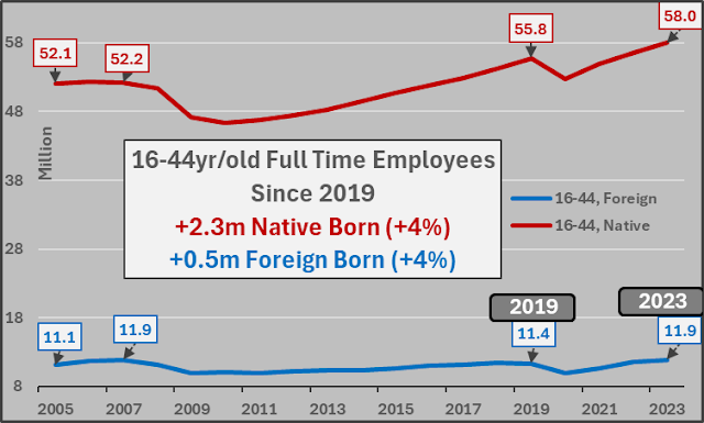
 As a quick aside, here's a visual representation of inversely correlated Federal Funds rate (black dash), federal government marketable debt (red), and Federal Reserve balance sheet (yellow) vs the 25- to 54-year-old population (blue) and those employed (green) among them.
 25- to 54-year-old employment to population ratio (white line) set against the Federal Funds rate (black dash), marketable federal debt (red), and Federal Reserve balance sheet (yellow). Ever since females were fully incorporated into the workforce (1990), the full-employment ceiling of potentially employed persons among the population has been around 81%. Once 81%'ish is reached, no fuel for further employment (or economic) growth remains, terminal federal funds rate is hit, and interest rate cuts and debt-fueled deficit spending ramps.
 Year over year change in 25- to 54-year-old population (red line) vs. year over year change in 25- to 54-year-old employees (blue columns), and population to employment ratio (white line). Deficit fueled demand creates deficit induced full employment until there is no further potential growth available...and then recession, interest rate cuts, deficit spending...wash, rinse, repeat (at ever greater cost and ever decelerating relative GDP growth).
 25- to 64-year-old population, 25- to 64-year-old employees, total housing units.
 15- to 74-year-old population, 15- to 74-year-old employees, total housing units.
 16+ year-old population, 16+ year-old employees, total housing units.
  Full time employee's vs total housing units. To be mortgage worthy, typically steady income from a full-time job is paramount. Housing unit growth is significantly outpacing full time employee growth...particularly concerning as we're at historical "full employment".
 Total US population, total housing units, and housing units per capita...well above the previous record set in 2008...and likely moving higher with record housing units under construction.
 Regarding the narrative of more households being occupied by persons living alone, structurally driving housing demand higher. I'd direct these folks to the Census data, which shows a flat to rising number of adults per household since the turn of the century...and all of the declining occupants per household are dramatically fewer children...not more adults living separately requiring a shift in higher housing units per capita!?!
 Regarding that record housing units under construction (dk blue line) and lower single-family housing under construction (aqua line), typically when new houses sold (white line) peaks and begins to tank, under construction follows. However, during this cycle tanking purchases have been met w/ accelerating supply. Curious...these types of mismatches are often seen amid bubbles!?!
 This extremely high housing units under construction vs falling new houses sold has left us with the greatest quantity of under construction minus new houses sold monthly in US history (lt blue line)...
25 to 54yr/old US population (blue), 25 to 54yr/old employees (green), total housing units (black dash). This represents 90%+ of 1st time home buyers.
This is in no way a complete overview of a highly complicated unique set of regional, and local markets...just some observations from the cheap seats. Thanks.